Colour isn’t just about aesthetics – it influences emotions, behaviours, and decision-making. When it comes to printing, the colours you choose can make a big impact on how your audience perceives your brand and marketing materials. Here is a brief outline of how different colours affect psychology and how you can use them effectively in print.
Understanding Colour Psychology
Each colour has a unique psychological effect, triggering specific emotions and associations.
Here’s what some of the different colours can convey:
Bold & Attention-Grabbing Colours
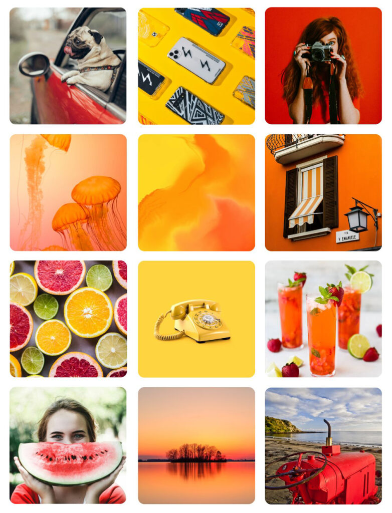
Red – Passion, energy, and urgency. Ideal for sales promotions, call-to-action buttons, and anything that needs to stand out.
Yellow– Happiness, warmth, and optimism. Great for grabbing attention in posters, flyers, and playful branding.
Orange – Creativity, enthusiasm, and friendliness. Works well for brands that want to appear fun and approachable.
Trust & Professionalism
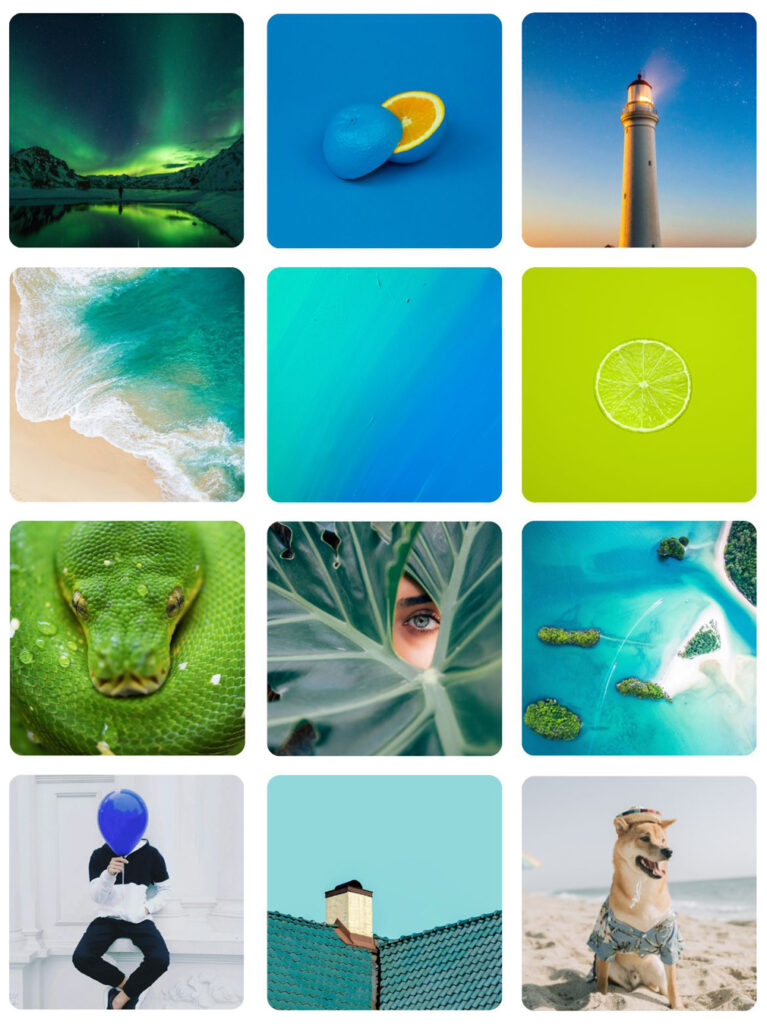
Blue – Reliability, professionalism, and calmness. A go-to colour for corporate branding, finance, and healthcare materials.
Green – Growth, nature, and health. Often used in eco-friendly printing, wellness brands, and financial services.
Luxury & Elegance
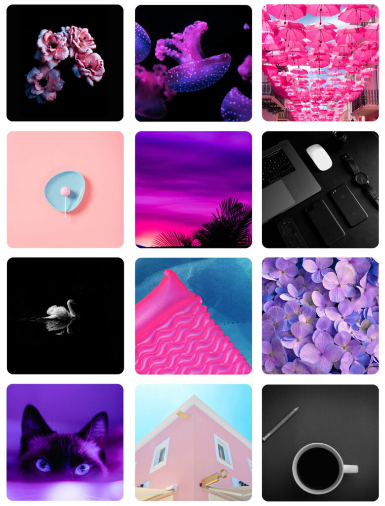
Purple – Creativity, luxury, and wisdom. Frequently seen in beauty products, premium brands, and artistic designs.
Black – Power, sophistication, and elegance. Common in high-end branding, business cards, and luxury packaging.
Pink – Love, warmth, and femininity. Commonly used in beauty, fashion, and feminine branding to evoke softness and energy.
Minimalism & Simplicity
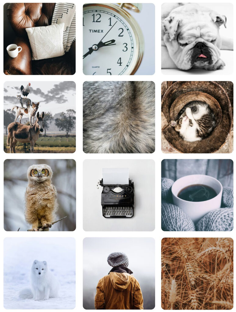
White – Clean, simple, and pure. Perfect for modern, minimalist designs, especially in medical and tech industries.
Grey – Neutral, balanced, and professional. Often used in corporate materials and sleek, modern branding.
Brown – Earthy, warm, and natural. A great choice for organic brands, handmade products, and vintage-style prints.
How to Apply Colour Psychology in Print
Now that you know what different colours represent, here’s how to use them effectively in printed materials:
- Marketing Materials: Want to create urgency? Use red or orange for sales flyers and limited-time offers. Looking for trust and professionalism? Stick with blues and greys.
- Business Cards: Creative industries might go for bold, vibrant colors, while corporate sectors tend to favour sleek blues, greys, and blacks.
- Posters & Signage: High-contrast colour combinations (like yellow on black or red on white) ensure maximum readability and impact while bright multi-coloured posters garner interest and catch the eye.
Final Thoughts
Choosing the right colours for your print designs isn’t just about what looks good – it’s about creating the right emotional response. Whether you’re designing a business card, a brochure, or a wide-format poster, understanding colour psychology can help you make a stronger connection with your audience.